Cairnhill Law
Background
Graphic design for a Asia-focused boutique law firm based in Singapore. This work was done in close collaboration with the international design agency Studio SKLIM, in order to ensure consistent branding and design elements across printed collateral, digital presence, and the aesthetics of the physical location.
Architectural details, from the construction of the interior to the furniture design, can be found on Studio SKLIM’s website.
Introduction
Cairnhill Law is a boutique law firm with a specific focus on Asia. Keeping with the sense of breaking the mould while still keeping it grounded with a certain level of seriousness, informed the choice of a monochrome palette with a yellow highlight. The scope and focus of the firm is invoked by earthly tones like yellows and greys, and heavy use of materials like batik and natural textures on the architectural side.
The overarching brand involves the abstract image of cairns, as reflected by the name of the firm. The general format of the logo resembles an official seal updated to modern sensibilities, and the logo itself went through a few iterations as we fine-tuned its different aspects.
The logo made out of plants at the reception of the Cairnhill Law offices. Photograph by Khoo Guojie.
It was decided early on that the primary font of the logo should be sans-serif, as its modern appearance signalled a break from traditional air of legal practice. An additional requirement was a Chinese dual of the English logo, for use in Chinese-language documents and the flip side of the name card.
To preserve brand cohesiveness, the fonts used in both versions should be complementary. Rudimentary considerations like 明体—serif/黑体—sans-serif pairings are a good start, but given that the logo should reflect the brand identity consistently across both languages means that more care needs to be taken. English-Chinese font pairings exist, but restricts the possible options. More often than not, organisations with enough resources commission a single typeface that encompasses both English and Chinese characters, like Microsoft YaHei by the Chinese conglomerate Founder Group, or the recently released Oppo Sans by the design firm Pentagram.

A comparison of 明体/serif fonts with 黑体/sans-serif fonts. The differences between the two font types are analogous in both languages.
This led to an attempt to do the same at a much smaller scale. An English font was first chosen for the logo, then studied to distil the principle design elements of the typeface. Then, the two characters needed for the logo — “坚山” — would be recreated by the same principles. Finally, a common grid was drawn upon which both logos were laid out.
Bauhaus Version
The clearest illustration of this process is with the Belgium font, a version of the Bauhaus font bundled with the printers sold by Brother Industries. The principles behind the Bauhaus school of thought are well-documented, as are their primarily use of geometric proportions. Every curved letter is constructed from only circular, vertical, or horizontal line segments. That meant that the variety of circular arcs are fixed — in order to meet the adjacent segments perfectly, the tangents at the end must be parallel to the line segment, which restricts the curved segments to quarter, half, three-quarters, and full circles.
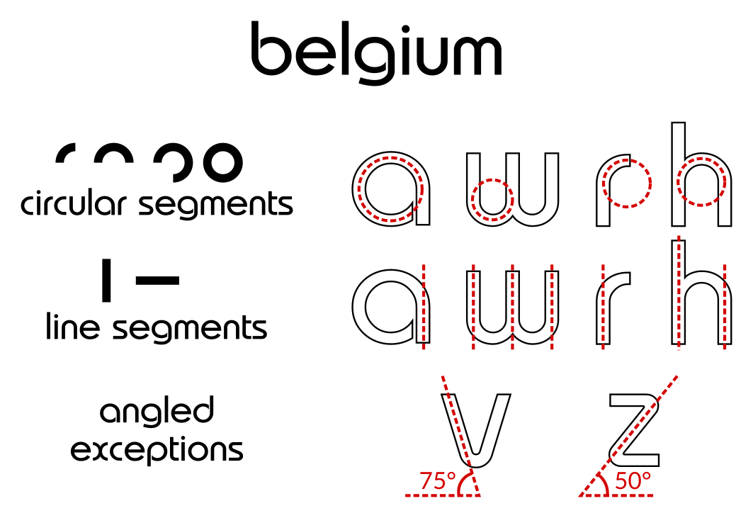
Font study of Belgium. The regularity and consistency of the shapes used is the primary motif of this font.
Where clarity is threatened, there are, of course, exceptions to these rules. The cross-stroke in “e” meets the circular segment at right angles, and the arc itself is 11/12th of a circle. The letters “v” and “z” contain angled strokes that connect to the adjacent arcs. These exceptions make up a fifth of the full alphabet, and the frequency of the exceptions in the Chinese version should be in the same range.
These principles are easily applied to most of the Chinese characters, especially those involving mostly vertical strokes. However, when it comes to letters like “又”, doing the same makes the character completely unrecognisable. This was fixed by applying the same exceptions as with the English font, allowing the segments to meet at 45° and 90° angles.
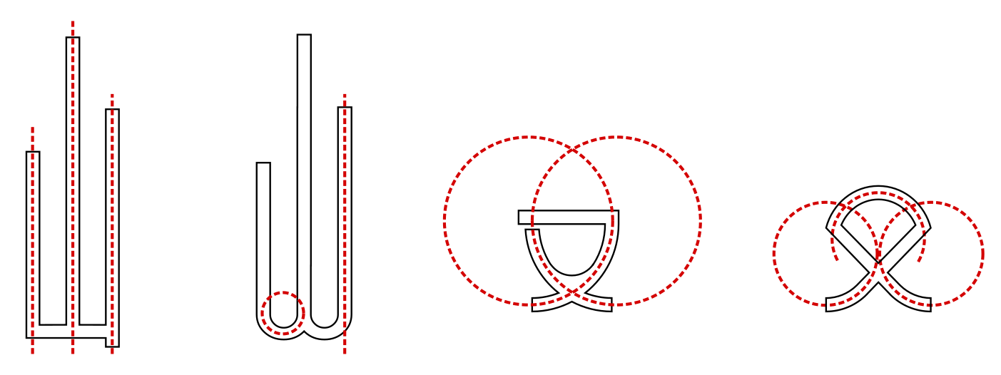
Designing glyphs for Chinese characters based on Belgium.
Finally, these elements are placed together with a cairn motif for the eventual Bauhaus version.
Final logo design in the Bauhaus style.
Geometric Version
Generally, these Bauhaus ideas can be found in geometric fonts — typefaces with a primary shape around which the letters are built. The oval from the aforementioned Oppo Sans, the roundedness of AirBnb’s Cereal, to the rectangular motif of Handel Gothic, used in many brand identities from Canon EOS series to the San Miguel Corporation.
It is the clarity of a single visual motif that make geometric fonts appropriate for use in logos, especially when the logos might need to be shrunk to small sizes in different mediums. For the same reason, we looked at using TeX Gyre Adventor, an open source version of Avant Grade Gothic, the title font of the magazine which gave it its name. Similar steps were taken to deconstruct the structure of the font. The shape motif in TeX Gyre Adventor are elliptical curves, and line segments, which can be diagonal, always end in horizontal or vertical cuts, which defines a clear text baseline.
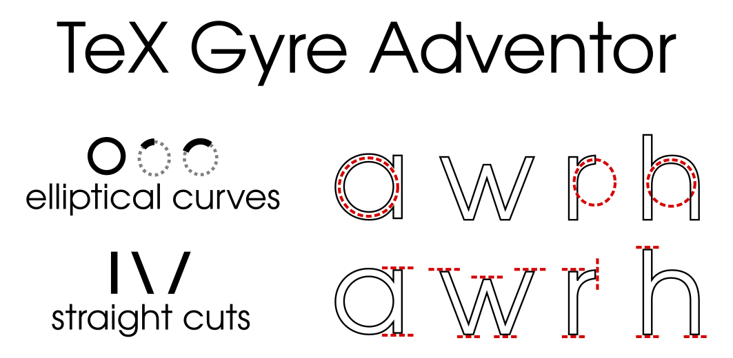
Font study of TeX Gyre Adventor. While it shares the regularity and consistency of the previous font, its strongest characteristic is its clear baseline due to the horizontal cuts at the bottom of each glyph, which makes it suitable for use as body text.
By the same token, the exceptions can be found in a character like “s”. It is actually made out of three circular segments of varying size, with the larger radius placed below, making it bottom-heavy and providing visual weight to the letter. Of interest is how the circular segments are even with a different radius. The bottom two meet tangentially, while the top two are aided with a line segment that serves as the tangent for both segments.
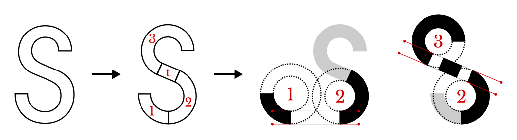
The glyph “S” is made up of four parts: three circular segments (1, 2, & 3) and a tangential connector (t). The bottom radii (1 & 2) are larger than the top radius (3) to make the letter bottom-heavy and therefore stable. All three circular segments are joined tangentially: directly for circles 1 & 2 and with the help of a tangential line segment for circles 2 & 3. The tangential connector extends the top half of the letter a little to the left, which is why the radius 1 is larger than radius 2: otherwise, there will be a leftward bias (the letter would “want to” fall anticlockwise) to the visual weight of the letter.
This led to the various designs of the Chinese characters by the same principles, and the corresponding logo.
Designing glyphs for Chinese characters based on TeX Gyre Adventor.
Final logo design in the geometric style.
Calligraphic Version
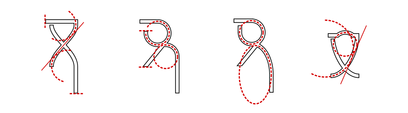
I was curious about trying to do the same the other way round, while keeping the final product sans-serif, somewhat. Particularly, I came across an interesting 圆体 (Yuán tǐ) font in the collection of open fonts by 王汉宗 from the mathematics department of Chung Yuan Christian University (中原大学).
Han Wang Yen Light is calligraphic without the embellishments of a 明体 font, instead emulating the calligraphic feel with gentle right angles and asymmetric shapes. The “sans-serif” nature of this font fit the bill of what was required for it to be used as the primary font for the logo.
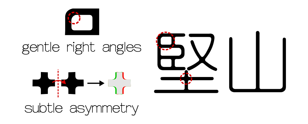
Font study of Han Wang Yen Light. It appears calligraphic without the embellishments, achieved by introducing intentional asymmetries to the rounded glyphs.
What was interesting was that the Chinese font had to be recreated by the same principles, as a condensed version was needed to fit the two letters into a square. Hence, both the Chinese and English glyphs were (re)created using the above principles to create the final version of the calligraphic logo.
Final logo design in the Calligraphic style.
While the two versions are cohesive by themselves, the calligraphic elements made it too traditional for it to bode well with the branding of the law firm, and was scrapped in the end.
Final Version
From the initial sketches, the Bauhaus and geometric versions were well received and it was decided early on that we wanted to continue going in that direction. In the end, we settled on using Stanley Kubrick’s and Wes Anderson’s favourite font.
Unlike the case of TeX Gyre Adventor, the sharp angles at the bottom means that the text baseline isn’t as clear, and we need to look out for visual weight. Unlike a flat base, a sharply angled one has its visual base little above its actual base.
In Futura, the exception found in TeX Gyre Adventor is the norm. The bulk of the font is made from circular and line segments, but where a circular segment meets a line, an interpolation brings one smoothly to the other. The “D” provides a simple example with an interpolating line segment, while the “R” provides a more complicated example between the bowl and the step of the letter. In the latter, the connecting segment begins with the curvature of the bowl, and gradually straightens out to a horizontal stroke that meets with the stem.
A few options for the Chinese characters were constructed by those principles, and the final version arose from that.
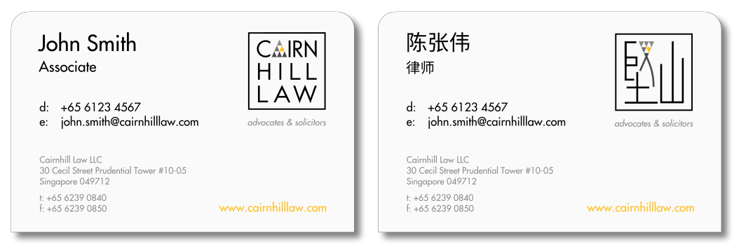
Final name card design. The information is in English on one side and in Mandarin on the other.